We Love: Anatomy Boutique
4 Aug 2017
Design inspiration can come from anywhere, and I always find it fascinating to hear where designers draw their inspirations from. So when I was introduced to Anatomy Boutique, an interior lifestyle company, who design wallpapers and ceramics, amongst other things; not only was I drawn to their incredible creations, but also the fascinating story behind them.
The owner and creative force behind Anatomy Boutique is Emily Evans, anatomist, medical artist, author, publisher and senior demonstrator of anatomy at Cambridge University. Phew! If that’s not enough to be going on with there is even more to her skills – check them out on, Emily Evans Illustration.
This is such an unusual path for a homewares designer, so we asked Emily a few questions about the inspiration for her designs and why she decided to go into the design side of things:
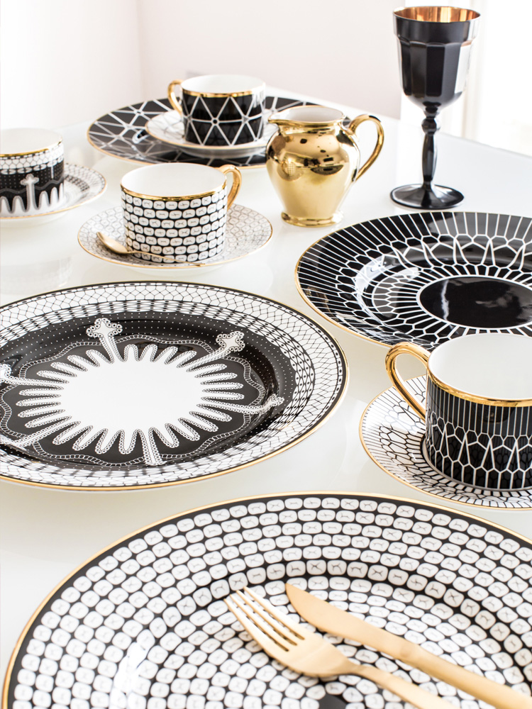
Anatomy of Digestion Collection
As you can see from this delightful table display the range of black and white china (all based on the digestive system) mix and match well, and are all made by hand and hand gilded in Stoke on Trent. Who would imagine it was possible to be inspired by teeth and then come up with this?
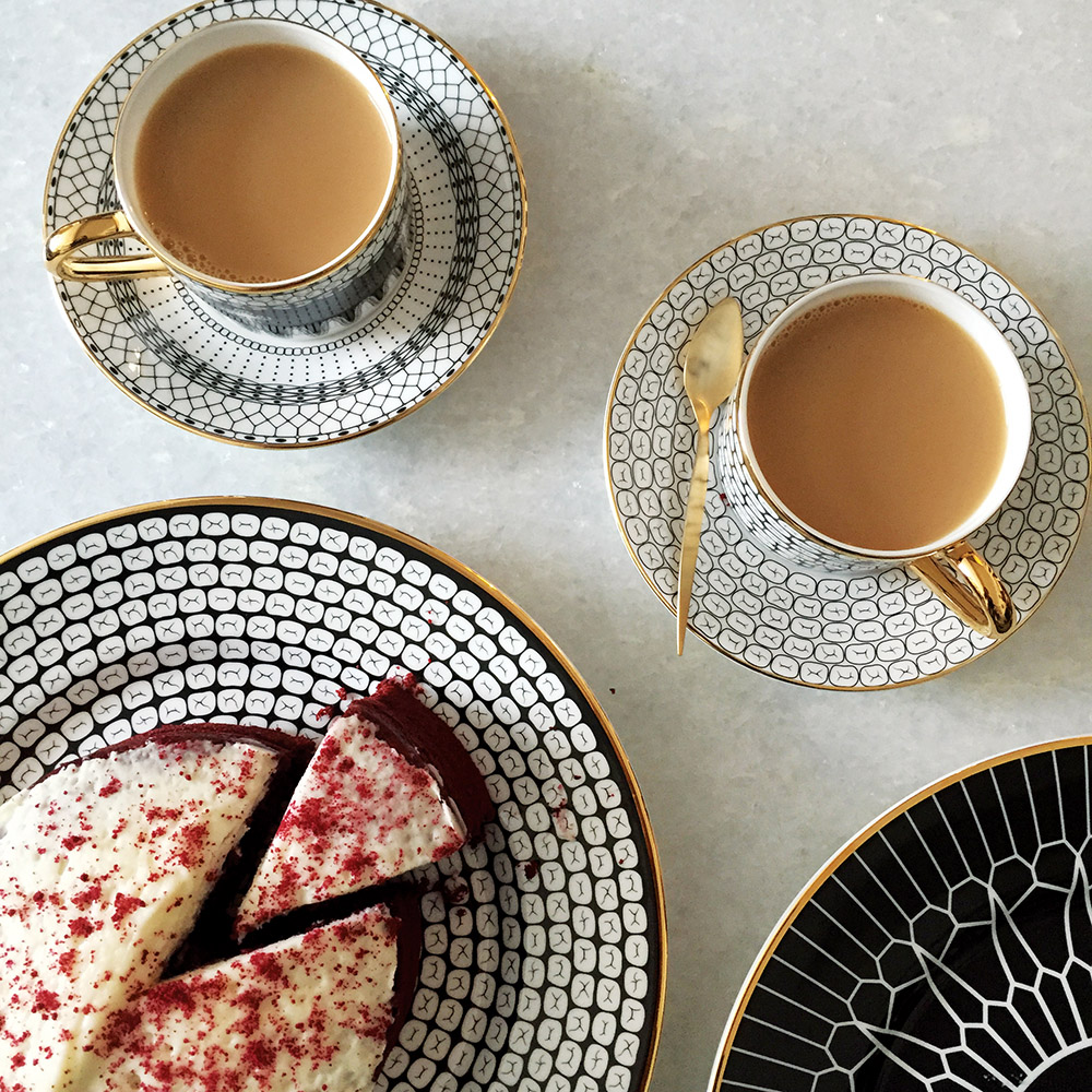
Anatomy of Digestion Collection
What inspired you to take your anatomy illustrations out of the context of academia and into homewares?
I had been a medical illustrator for about 12 years working from different shared creative spaces in London, and conversations with fellow ceramicists and interior designers in those spaces inspired me to try out some of my patterns and designs on homeware products. The histology plates began as an idea for an event that was just fun to do, I didn’t expect people to love them so much. I set up an online store pretty much to prove to my friends (after much encouragement from them) that no-one would be interested in this stuff… 4 years later, they’ve definitely proved me wrong! The response I gleaned from customers was so direct and rewarding compared to working for large publishers on anatomy books. The amount of interest in these pieces allowed me to educate people about anatomy through everyday objects – they seemed more accessible to people than academic texts. I teach the medical students anatomy at Cambridge University, and it’s often seen as quite elite. With my shop, I like the fact that my customers come from many different fields and backgrounds and what unites us is our interest in the beauty of anatomy.
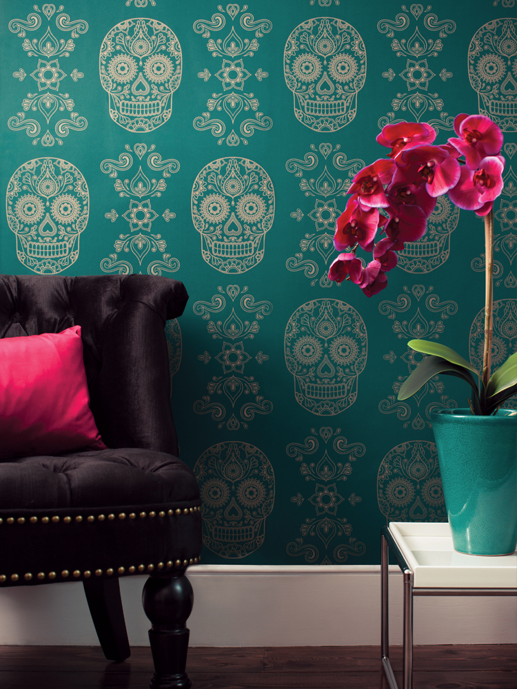
Mexican Day of the Dead Sugar Skull Wallpaper- Emerald
Can you tell us a little bit more about the Mexican Day of the Dead Sugar Skull, and why you chose to feature it on your wallpaper?
About 5 years ago I went to Mexico for the first time and was blown away by their folkloric art and craft designs, though I felt frustrated that all the things I saw just wouldn’t work in my urban home, I wanted something elegant and luxurious. After obsessively drawing sugar skulls after I came back, a colleague in my work space asked what my designs were for, and I explained I had a dream of creating a teal and gold wallpaper after visiting Lord Leighton’s house and being intoxicated by the interior colour palate there. She was an interior designer for a Mexican bar chain, and she pitched the idea to them. They loved it and used the wallpaper for photo shoots for ELLE magazine in their bar. It ended up on social media and people were asking where can they get hold of it, so I decided to start manufacturing it. That summer, just by chance sugar skulls hit the UK and were everywhere. It remains our best selling product.
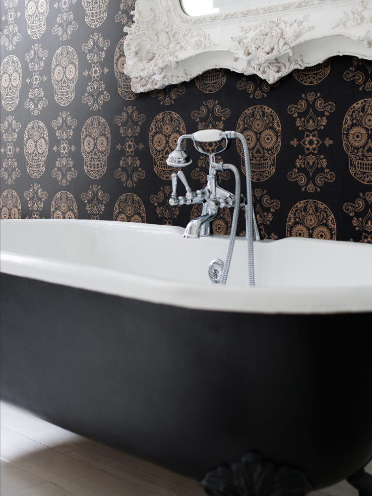
Mexican Day of the Dead Sugar Skull Wallpaper
Do you have any plans for further homewares collections?
We are launching a new wallpaper design incorporating the anatomical heart this autumn, and also a new china collection called ‘bruised but not broken’. I’m excited to see how people react to them as they’re quite emotive as designs. I think it’s important to be challenging with ideas, and push design forward, so I like using people’s preconceptions of anatomy to play with that line between beauty and awe to draw them in to another world – the interior world.
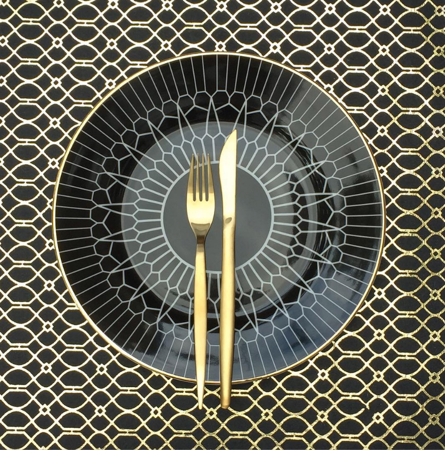
Anatomy of Digestion Plate- Arteries
I have to say I am in awe of Emily’s credentials , and then to be able to design such stunning homewares from scientific study is quite amazing. What do you think? Do teeth and arteries come to mind when you view this china?
Jacqui x
Never miss a post: follow us on Bloglovin’!
Image Credit: Anatomy Boutique
8 replies to “We Love: Anatomy Boutique”
Leave a comment
Your comments make us happy!







Such an interesting concept. I really hope she expands the range to other homeware items. The wallpapers and China collection are stunning, but I need more!
They also do notebooks and mugs, which are lovely. Can’t wait to see their new collection!
great find ladies! I love the wallpaper collection! I would love to use this in a really dark small space! (one for the lust list thats for sure!)
Thanks Jade, so glad you like it! The black wallpaper would be fab in a downstairs cloakroom!
Now that was totally unexpected! It was only after I saw the title of each product that I really saw what was already there, brilliantly unique. Are you guys thinking of selling them on your shop? The concept of black, white and gold rim is classic, trends will come and go but this will still be there. Thinking of creating a modern mix and match set with this, Elley Kishimoto and Curious Department.
They’re just so unusual aren’t they! I’ve never seen anything like it. Your mix and match set sounds fab! They will all be timeless classics which you’d pass down through generations. We won’t be stocking them this year, but maybe next 😉
LOVE IT! I’m a big fan of tea cups and all the china and I really want one from their collection now! It’s such an inspiring story as well. Who would have thought that such beauties can start their life as medical illustrations!!!
I know!! It’s incredible isn’t it, just goes to show how design inspiration really can come from anywhere! Let me know if you do decide to buy any, would love to see them in-situ!