8 Top Tips: How To Use Colour In Your Home To Create A Beautiful And Cohesive Scheme To Be Proud Of
22 Jan 2021
Colour is what makes our homes personal, it’s a reflection of our personality and our emotions. That said, how do we find out what we like, what makes us feel connected to our homes, and what makes us happy? How to use colour in your home baffles many of us, but it is the starting point for any scheme to be successful. Now we are spending so much time at home it feels essential to get this right, so we can enjoy our home and feel comforted and enlivened by our interior spaces.
We’ve brought together 8 tips from our blog features on inspiring homes and hopefully, it will inspire you on how to use colour in your home to create a beautiful and cohesive scheme to be proud of.
1. Start Small & Build Your Confidence
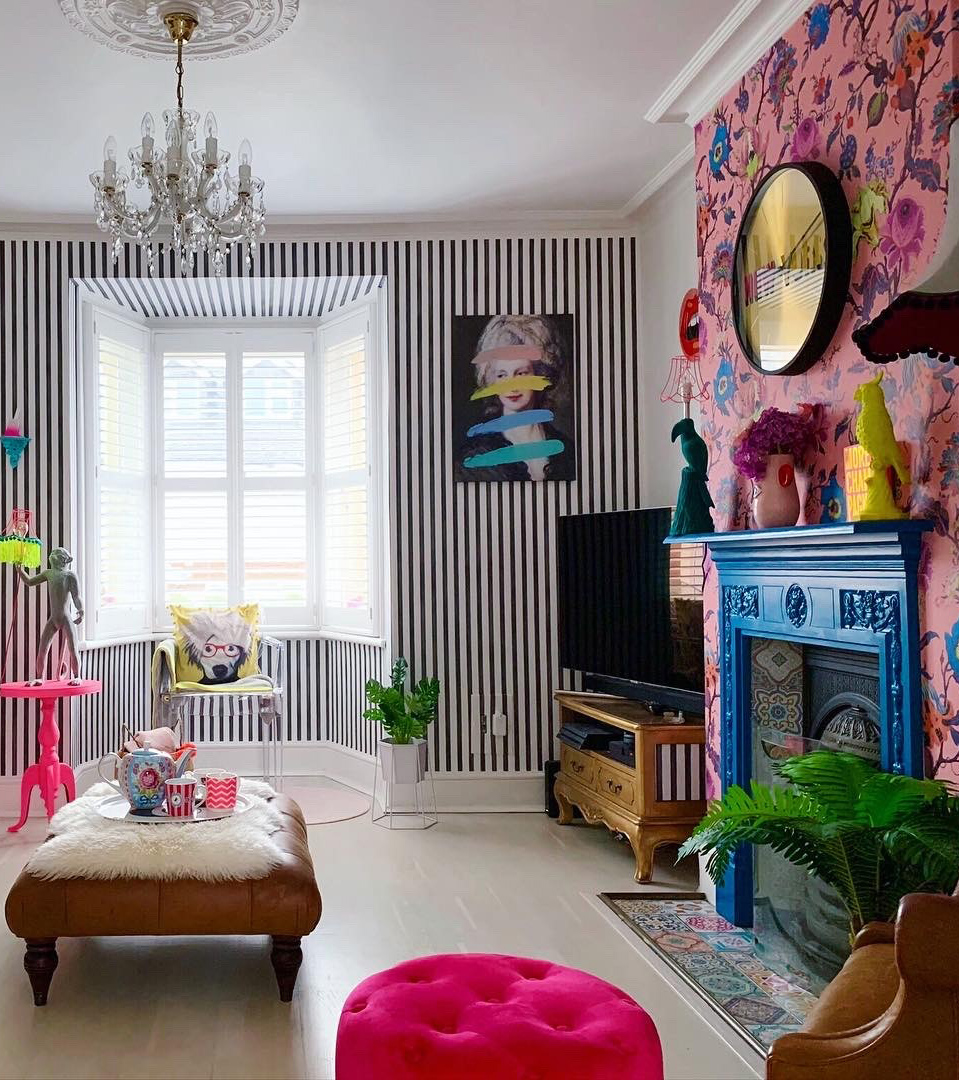 Image credit: @lucyhamiltonathome
Our first tip for how to use colour in your home seems so obvious really, doesn’t it? So much easier and cheaper to repaint a small room if you find you really can’t live with a colour. As with anything, practice is the key – the more you experiment the quicker you find out what suits you and feels right. And sometimes you might love a particular colour or wallpaper, but not necessarily in a room in constant use. When I first moved into my house I painted my small downstairs loo in Arsenic, by Farrow & Ball because I love the colour, and I still love it, but I couldn’t have it in a room I spent any time in as I find it too intense, but I love the shot of colour on an infrequent basis.
As Lucy from @lucyhamiltonathome says; “My biggest tip is just go for it. If you don’t like it, change it. I think people are so scared to be brave in their homes which is why grey becomes the popular choice. I’m not sure people even like everything grey it’s just the safer option. My advise is choose a small room like a laundry room or spare bedroom and just go for it, build your confidence. Then you become brave and end up living in a home filled with colour!” And they don’t get much more colourful than Lucy’s!
2. Experiment With Cheap & Easy Ways To Add Colour
 Image credit: @lucyhamiltonathome
If you are nervous about adding colour to a scheme, start with really simple additions that are cheap to buy and quick and easy to do, like washi tape around door frames and on the edge of shelving. That way you get to test out colour combos without being committed to painting. Lucy from @lucyhamiltonathome is a big fan of stickers and other quick, cheap ways to add colour; “One of my favourite things is colourful tile stickers. Can add them to your bathroom or kitchens. Colourful pompoms sewn on cushions. Spray painted picture frames, colourful and fun prints, tassels on shades are all great ways to add colour in your home.”
3. Consider The Colour Wheel
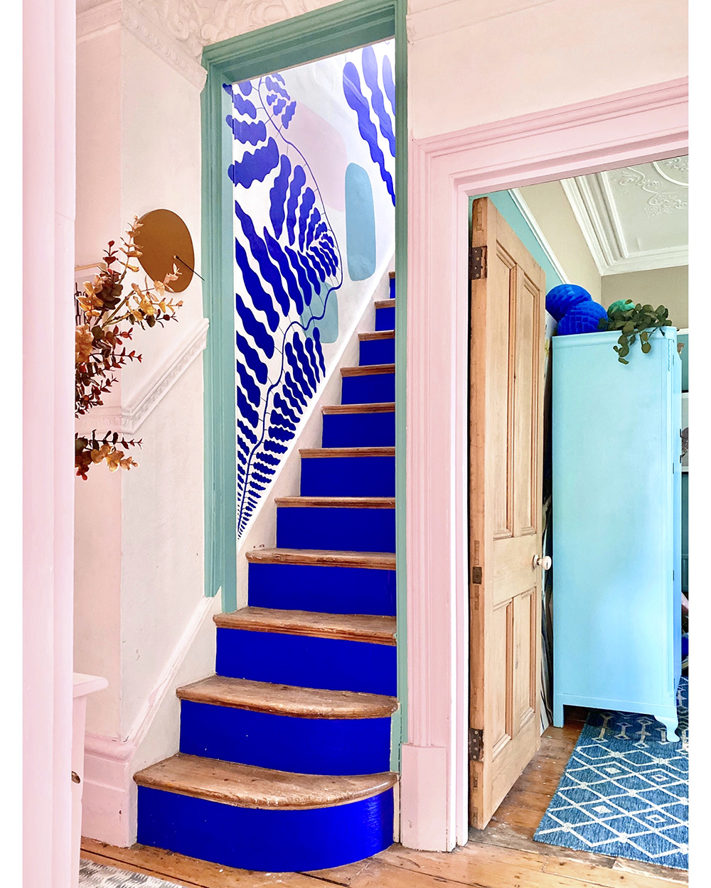 Image credit: @annalysejacobs
I have to say I haven’t studied colour theory, as I work on a purely instinctive level as to what I like, but there is so much detailed information out there if you want to pursue the subject in more detail. I think using the colour wheel is a good way to consider colour schemes you may not have thought of before though, and you can feel confident the colours go if you’ve chosen them according to different colour theories. Anna Jacobs, a British artist and designer known for her colourful and inspiring homewares range, has some good tips on how she uses colour in her designs;
“There are about 7 classic colour structures you can use, which will always work and then you can dial these up or down, depending on how calm or energetic you want a room to be and on how warm or cool you want it to be.
In general, I find that the two easiest to use are a ‘harmonious’ structure, which uses 3 to 5 colours next to each other on the colour wheel, and a ‘split complementary’ structure, which uses two colours almost next to each other on the colour wheel, plus one directly opposite them. I use both of these a lot!
Then remember to use CONTRAST in your scheme! Dark and light, dull and bright, large area v. small area.”
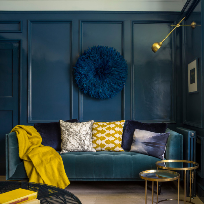
4. If Going Dark, Think Lighting, Lighting, Lighting!
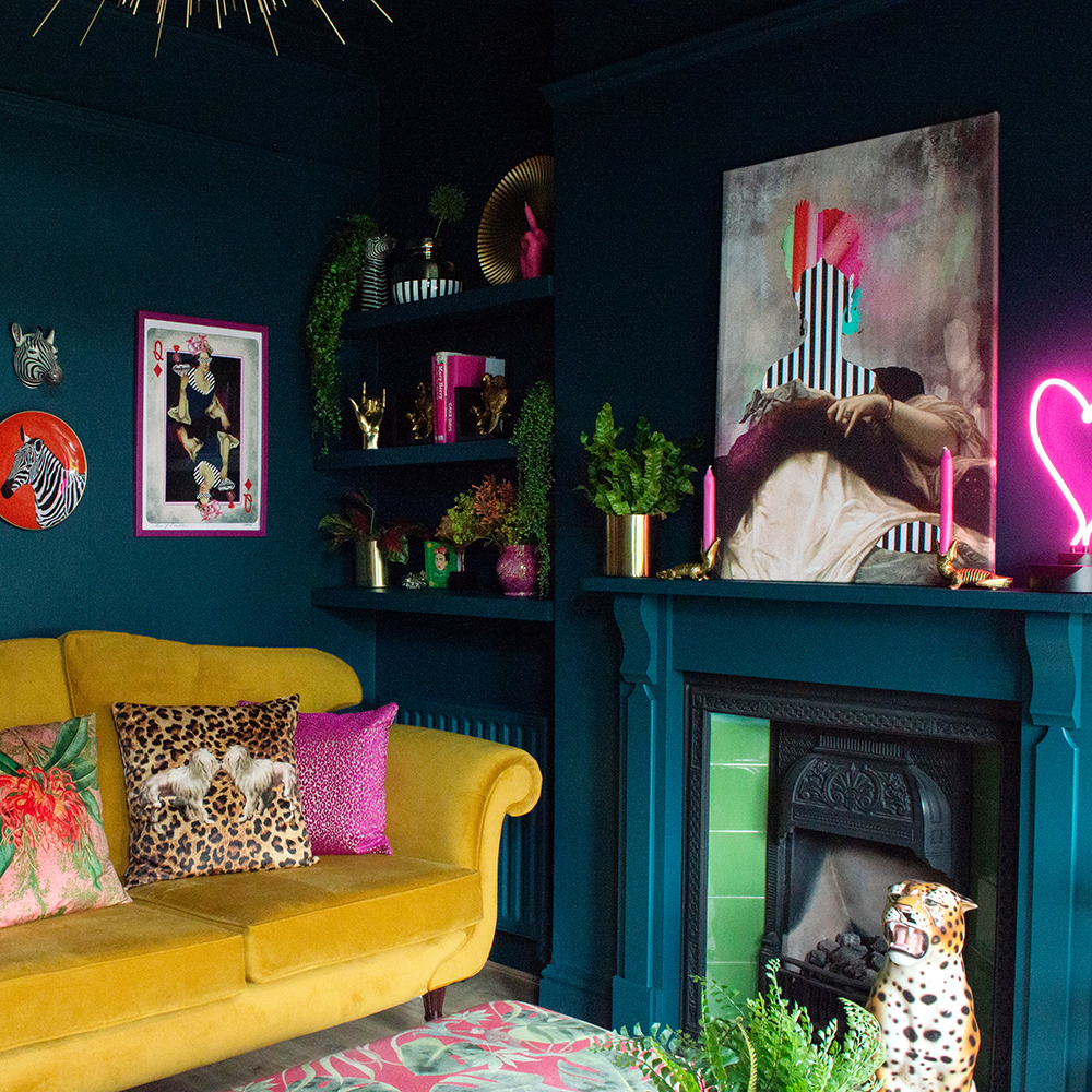 Image credit: Audenza
When Amelia had finished her fabulous sitting room she realised that the dark walls required spots of accent lighting everywhere to create a glow, and eradicate those dark corners. Unfortunately it’s not so easy when the painting is finished! Easy enough to add lamps, providing you have sockets in the right place, but the biggest issue was the shelving in the alcoves. They need downlighters to emphasise them and showcase the objects. So, think seriously about your lighting choices before decorating the room, particularly important if you are going dark.
Angie, from @somethingbluehome has this advice; “The key to making dark interiors work is LIGHTING. You need to overdose on the lighting and aim to have at least 8 different light sources, this is what is going to transform the space and create the soft and seductive mood. I think pendant lights coming from above can be quite unflattering and harsh so I recommend having these on a dimmer switch so that you can adjust it. Put all lights on dimmers where possible. Oh and lots of lamps too!”
5. Don’t Skip The Tester Pots!
 Image credit: @thegirlwiththegreensofa
We’ve all done it when we are in a hurry – thinking we had found the perfect colour and didn’t need a tester pot! But alas, it’s a recipe for disaster. Tester pots are essential, and despite the cost, they will save you money, and time, in the long run. Use a roll of wallpaper lining paper and cut it into big pieces which you can then paint with the tester pot and masking tape to the walls in various places. Put one up near the window and one in the darkest part of the room and live with it for a few days to see how the light changes during the day and affects the paint colour.
Nicola Broughton from, The Girl with the Green Sofa has experienced this herself; “I once painted my old kitchen a terracotta colour, or at least that was what it said on the tin. It was quite a lurid orange colour and I really should have used a tester pot first. Colour changes so much room from room, you really should try it before you go to all the effort of painting to discover you don’t like it. I lived with that kitchen for 3 years until we started the building work!”
6. Don’t Paint Testers Directly On The Wall!
 Image credit: @somethingbluehome
Another classic mistake we are all guilty of is painting the tester pots straight onto the wall. So much easier at the time, but goodness me it can take some painting over to cover the dalmatian spot effect. As Angie, from @somethingbluehome, can testify to; “Many moons ago – when I was testing samples, I used to paint them directly onto the walls. I remember there once when there must have been at least 30 different spots that I then desperately tried to cover up with layers and layers of paint!”
7. Find What Works For You
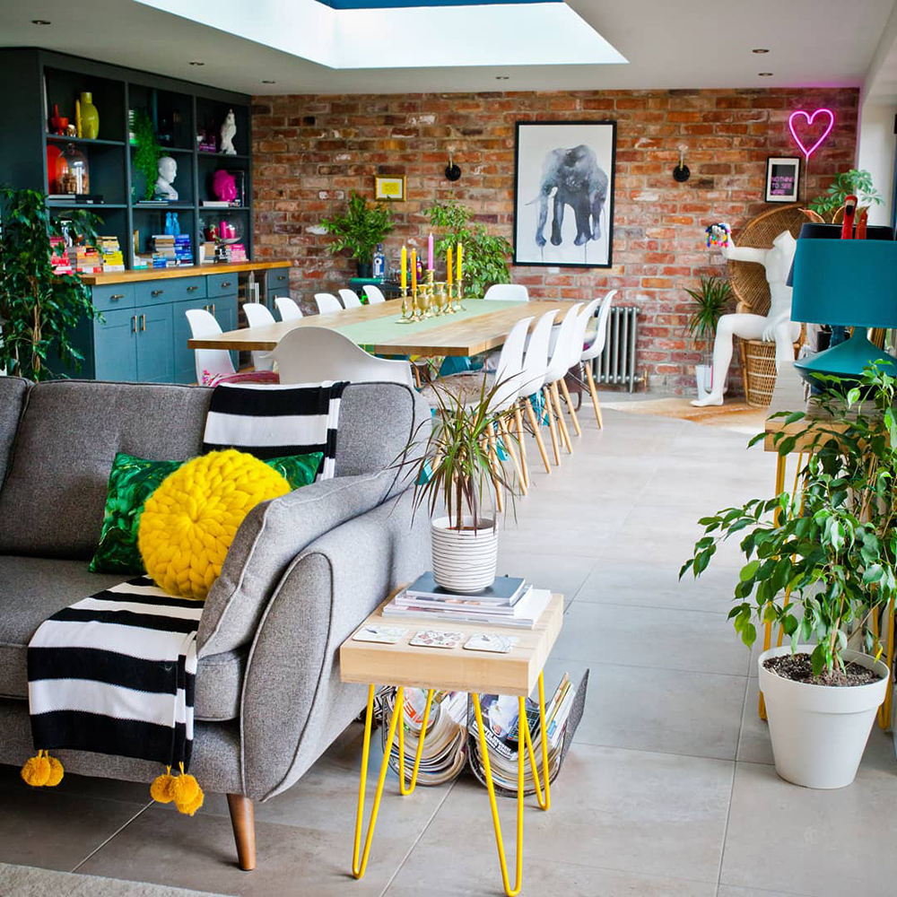 Image credit: @oxfordone
How to find what works for you? Pinterest and Instagram are great ways to see other people’s homes and imagine yourself in that setting. It could be you prefer bold colourful wallpaper and pick out the colours from that for the furniture and accessories, or maybe you are a pure maximalist and want it all? Or perhaps you prefer neutral walls with furniture and accessories that bring the colour in? Lissi at @oxfordone recommends if you want to use lots of different colours in one room, whilst still looking considered and edited, it’s easier starting with a neutral base of white walls;
“I think this is definitely easier to achieve with white walls and so in our open plan space where even the sofas and dining chairs are neutral, the rainbow of accessories does all the talking. I try to pick out the same accent colours at different points around the room so that wherever you look it feels deliberate and not chaotic. In the rooms where we have a dominant wallpaper, I have kept the colour palettes simpler but still bright and fun with plenty of pattern and texture.”
8. Listen To Your Own Reactions To Colour
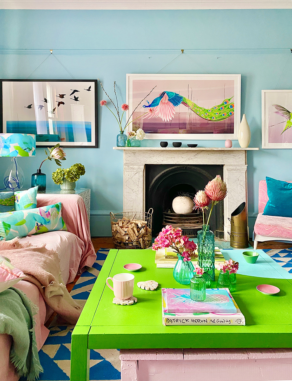 Image credit: @annalysejacobs
We all have an emotional response to colour, so whatever the colour theories say you have to trust your instincts and go for it. The only way to really find out what works for you is to experiment and be brave. As Anna Jacobs says; “I use a mix of colour psychology and colour theory, but you have to listen very closely to your own personal reaction to colour too, which might contradict and take precedent over these.” But also, don’t worry about what anybody else thinks! Our home should be about us and our choices.
Pink and green feature predominately in my home and sometimes my daughters will say “No mum, no more pink, please” but, you know, it’s my home and I like pink! And I’m in good company here, as Anna Jacobs uses a lot of pink in her home too; “As a single parent running my own business, I live with fairly constant stress, so I have surrounded myself with a lot of blues and greens, because they are calming and nourishing colours, but I add pink highlights to warm them up and create a welcoming feel.”
How to use colour in your home is an emotive and endless subject, but the essentials are starting small and doing what you love. As you become more experienced you get a feel for what is right for you and become more confident on how to use colour in your home, your way. It is an exciting and ongoing project that will evolve over time to bring joy to your home. I can highly recommend Love Colour, by Anna Starmer as the go to book for interior colour inspiration. Read my previous blog post for a review of this amazing book, It’s the perfect reference book, whether you love neutrals or bolds, it’s got it all.
Leave a comment
Your comments make us happy!