Flower Styling- Just Because
2 Feb 2015
I hope you all had a lovely weekend? Having attended the Maison et Objet trade fair in Paris last week, which was amazing but exhausting, we were in need of a relaxing few days, so ours was spent pottering and catching up on a bit of work.
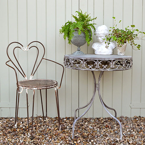
Just as a quick post today, I wanted to share with you two gorgeous images which Amelia and my mum styled over the weekend. Originally, I was only going to use one image, but when we were discussing which to pick, both of them preferred the top image and I preferred the bottom. So I thought we’d put it to the vote?!


I think for me with this one I like the vignette cropped a little closer in, and I love the combination of the marble board against the blue and the blue being that bit more vibrant. More than anything though, with both images it’s the colour combo for me; orange and blue… dreamy!
Don’t forget to let me know which one you prefer!
Hollie x
Never miss a post: follow us on Bloglovin’!
‘Flower Styling- Just Because’ written by Hollie Brooks
Photography: Amelia Brooks/ Styling: Jacqui and Amelia Brooks
6 replies to “Flower Styling- Just Because”
Leave a comment
Your comments make us happy!

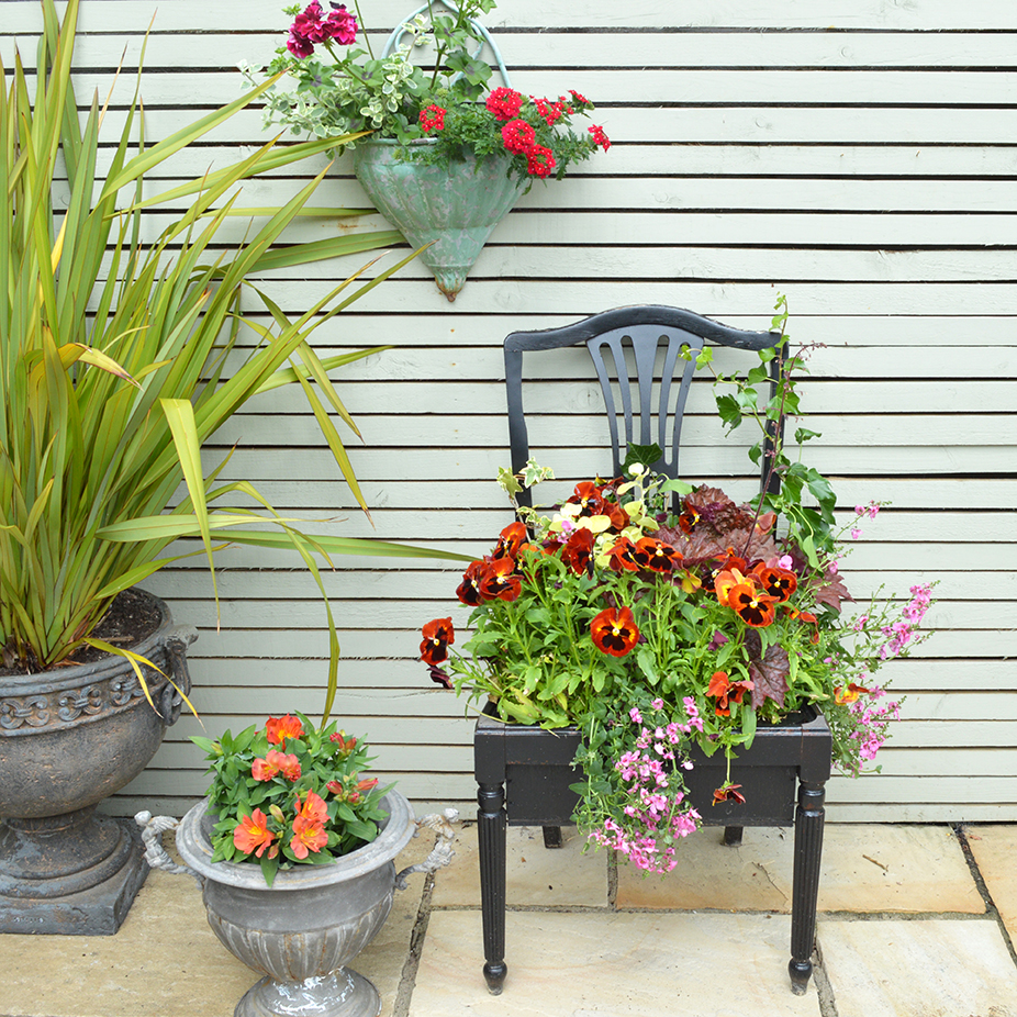



I think for me it’s the first image. It took me ages to figure out why and I think it’s down to the black base. Both very beautiful though!
Hi Ashlyn, thanks so much for your comment- the first image is winning so far then! 🙂
Oooh don’t make me choose!!! They are both gorgeous – I think if someone was pressing a gun to my head (which would be a really bizarre scenario, no? PICK WHICH ONE YOU THINK IS PRETTIER NOW!) – I would have to say the top image. Although I genuinely couldn’t tell you why!! lol
And thanks so much for your sweet compliment about my redesign! So appreciated – it was so much work but I’m so glad it’s finished! lol xxx
Haha! Well I guess prettiness is pretty important!!
Well, it looks like I’m definitely out numbered now! Good to know I have odd taste!! 😉 Oh and you’re very welcome- I can certainly attest to how much work site designs are! xx
has tone the first image its the black base that does it ..adds to the contrast and drama..sorry Hollie ! xx
Well, that’s it then! I well and truly lost that one! xx