Website Heaven or Hell?
23 May 2012
We thought we’d give you something to get your teeth into for the first few blogs, so here goes with the second one of the day!
With the rise of Internet shopping and the decline of consumers venturing out to the high street, I’d be very interested to know who out there actually prefers the act of Internet shopping over going physically shopping? What I’m getting at here, is, I don’t think I actually enjoy shopping on the Internet! I love the convenience of it, but ultimately seem to end up frustrated by fiddly and hard to navigate websites.
For that reason, and without a physical shop, our site is our message to the world about who we are and what we are and it was really important to us to make sure we got the right balance of design and functionality, not only does it need to look good, but most importantly, it needs to be quick and easy to use!
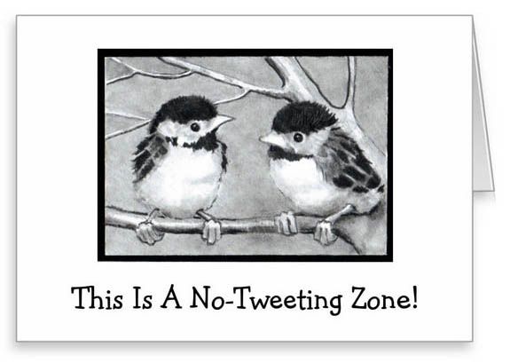
Rather apt and very cute greeting card by JoyArt
All three of us are impatient beings when it comes to websites, clicking back off again at the mere hint of something that might take more than a few seconds. A lengthy, fancy intro, taking too long to load, a tweeting bird in the background that will only be silenced by muting your computer or even those product menus that require you to have to hold the mouse in just the right place and hover for a few seconds so that you can then scroll down and select what you want- but then heaven forbid you’ve got an over zealous mouse that slips to the side slightly, otherwise you’ll have to do it all over again!
These, amongst a whole host of other things, are all issues that have made us give up on a website in the past. I realise we must sound like grumpy old women here and it’s probably due to a lack of patience, in fact, yes I’d definitely put it down to that! But I’m quite sure we are not alone in our impatient web browsing. Or are we? Have we just shown our true grumpy, impatient colours to the world?!
So, on that note, (and hopefully without judgement from our previous admission, because there’s guaranteed to be more where that came from) what we hope to bring to you (and this is a brave statement seeing as though we have not yet got a functional website) is a beautiful, intricately designed site, that makes your browsing and shopping experience effortless and dare I say it, painless.
We would urge any of you who have pet hates about websites to speak up now and get your request… or should that be detest… in before we begin our build! We would also welcome comments once we are up and running, if there is anything at all that you find hard to use about our site, please do let us know so that we can look into changing this. Remember, effortless and painless is the aim here!
To get to the point that we are at now, we have grilled an awful lot of web developers (and when I say grilled, I mean two A4 pages of questions ready to fire at them). However, we finally managed to make our decision and we are really pleased with who we have chosen- hopefully you will agree when the site is live!
With a lengthy site build ahead of us, we may not be live until around the beginning of October. But fear not, with all that extra time on our hands, we are able to source even more wonderful products to bring to you!
In the months to come, please keep coming back to us here at ‘Audenza: The Rocky Road to All Things Lovely’, where we will be discussing… well… just that really!
Audenza x
By Hollie Brooks
7 replies to “Website Heaven or Hell?”
Leave a comment
Your comments make us happy!










Ha! Nothing worse than hard to use websites! I hate it when I scroll all the way to the bottom of a page, click on something and then when I press back it goes all the way back up to the top of the page again!!
Being a new mummy I have little time for..well, anything really but unorganised sites especially. I need clear headings and not too many sub headings so that I can access the info I need super quick 🙂
Wishing you the best of luck with the new site and ill be keeping up to speed with progress during the night feeds! X
Im really looking forward to what your website will offer. Nice to hear someone is finally creating a site that will be easy to navigate 🙂
Thanks for your feedback on this guys, really appreciate it and keep it coming!! The more we hear about the things you hate about websites, the more we can try to avoid doing it on ours!
Focus on fast browsing (tip: use CloudFlare); to begin with only use functional elements – you can beautify later; use industry proven tools and first of all think “performance based”. Good luck 🙂
Thanks for the tips 🙂
[…] of the site (remember how we discussed it was important to us to get an EASY to use site here) so please do leave us some comments […]