5 Tips for Incorporating Bold Wallpapers in your Home
10 Mar 2017
We all love a bit of wallpaper but it’s an expensive option so we often play safe, which is such a shame when you see the fab wallpapers out there, so here are 5 tips for incorporating bold wallpapers in your home to get your creative juices flowing.
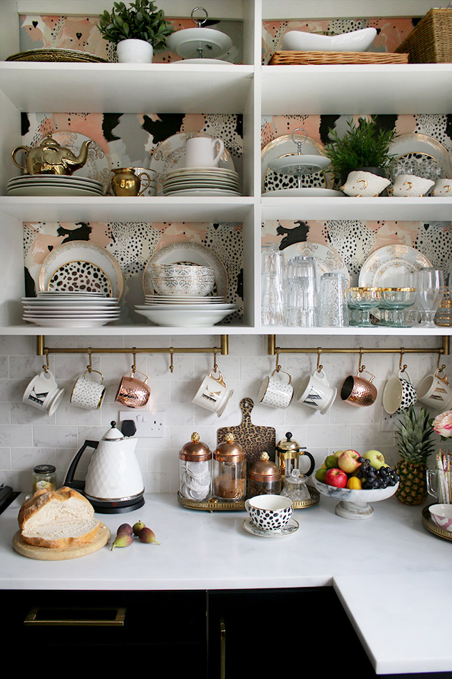
Image: Swoon Worthy
1. Bold wallpaper behind open shelving for just a splash of pattern. You may remember spotting this fabulous wallpaper in our sourcebook post: 17 Patterns and this is a great way to add some drama into a room without going crazy – and it’s so much cheaper, of course! Try this wherever you have open shelving – be it a bookcase, a bathroom cabinet or kitchen shelves. This image is from the kitchen of the lovely Kimberly of Swoon Worthy. Take a look as she has a fantastically inspiring blog with a lot of great ideas.
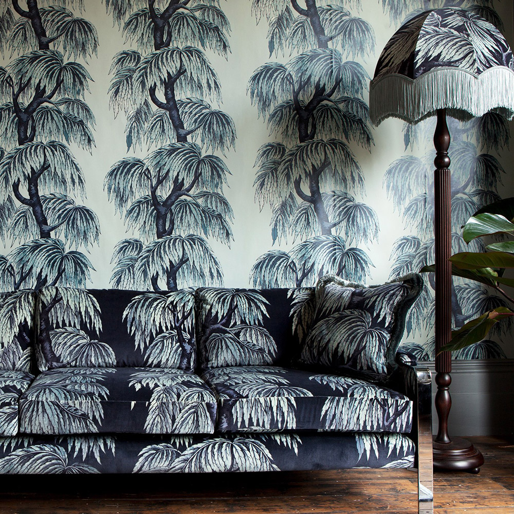
Image: House of Hackney
2. Feeling adventurous? Layer up patterns – this is for the really way out and totally brave, amongst you. I absolutely love the way the pattern (called Babylon by House of Hackney) is replicated on walls, sofa and lampshade. It doesn’t have to be the same design to get this layered look – any patterns that are similar, and with the same colour tones, can achieve this intensity and help create a truly dazzling décor. You do need to keep the room relatively clutter free otherwise it becomes a mish mash that fights with the pattern.
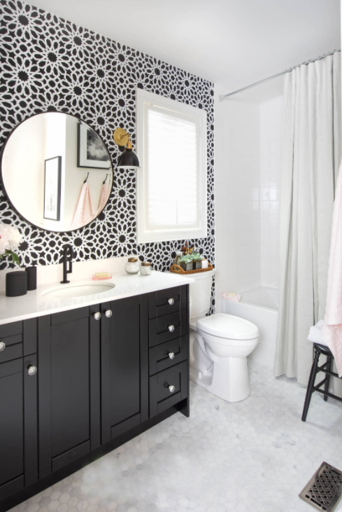
Image: Loom Decor
3. Stick to monochrome if you prefer a more contemporary cleaner look that lets the pattern speak for itself. A really sharp, graphic way to decorate that lets the wallpaper speak for itself. Another clutter free environment though otherwise it spoils the clean lines.
Image: Lucy Interior Design
4. Small spaces like bathrooms or hallways are the perfect place to use bold wallpaper. How glamorous is this cloakroom? A romantic floral extravaganza and, as a little used room, it brings a little bit of that surprise element to your home, particularly if it’s a totally different style from the rest of your décor. With rooms that aren’t actually lived in you can really go wild because you don’t have time to get bored with them as you’re only passing through.
Image: Rebel Walls
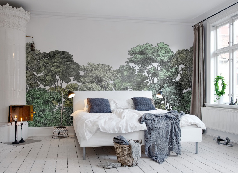
5. Want to be on trend? Go for a mural – the hottest new way to wallpaper that lets you create a story in your home. Do you dream of sleeping in a forest, or imagine yourself living in a crumbling French château, or just want a view of deep blue sky? Then a mural says it all. Take a look at our blogpost about mural wallpapers by Rebel Walls.
So what do you think? Do any of these tempt you into going bold?
Jacqui x
2 replies to “5 Tips for Incorporating Bold Wallpapers in your Home”
Leave a comment
Your comments make us happy!


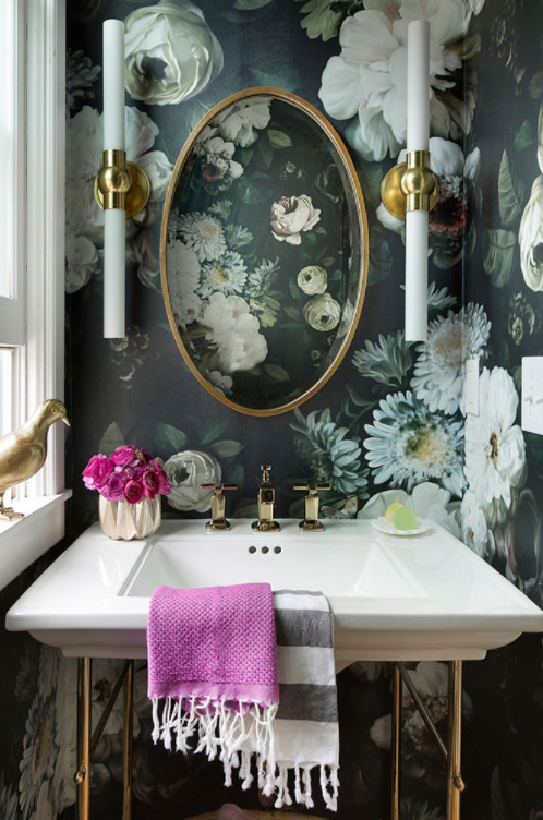





What is the name/pattern of the paper above shown from Lucy Interior.com? It looks like the background could be a teal blue with magnolia flowers scattered throughout. What a gorgeous pattern and it would be great in my powder room.
I’m afraid I’m not sure who the paper is by, the room has been designed by a company called ‘Lucy Interior Design’ – if you follow the link in the post to lucyinteriordesign.com, you will be able to contact them. I’m sure they’ll be happy to advise!