House Renovation- After Shots
24 Apr 2013
Last week I posted about a house renovation that my brother, Daniel who is a property developer is working on. You can see lots of shots before the renovation here, but this week I’d like to show you the after shots!
Remember what the garden looked like before the renovation? Well this is how it looks now..

Such an improvement. One of my other brothers (I have three!) is a tree surgeon and gardener, so he removed several large trees which were making the space dark and cramped and removed about two tonnes of soil and concrete. Sandstone slabs were then laid to create a really lovely area for tables and chairs (just out of the shot). I love the colour that Dan has painted the garden gate too, the outhouse (which has been re roofed and re pointed) is the same colour as well. I think this colour is perfect for a renovation project that you’re planning to sell on, it’s very neutral and non gender specific, but still really classic and stylish.

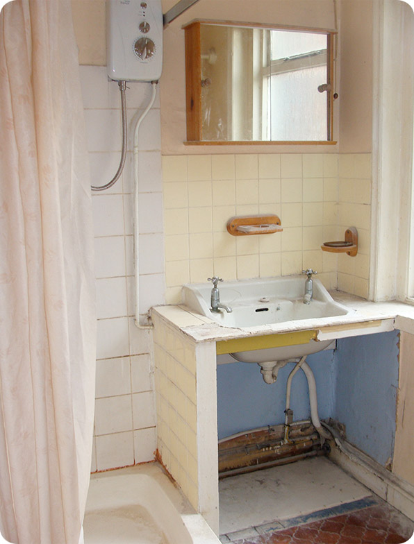
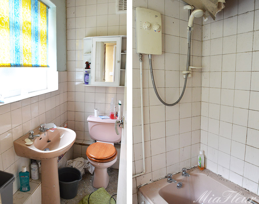
What a difference to the bathroom eh? The whole thing has been completely renovated, with new shower, tiling, floor and units. I think adding a bath is a must really for renovation projects, for so many it’s something that could make or break a property, particularly if you think your target market might be young families with kids.

So this is the in between stages of the kitchen and reception rooms- literally everything was ripped out in order to start again. The house had a new roof, new wiring, central heating installed, re plastered, new carpets upstairs, new laminate floors laid downstairs and new UPVC double glazing at the rear. So, as you can see, this really was a full renovation!

And here is the finished, fully renovated kitchen! We thought we’d show you a direct comparison to the old kitchen here, so you could really see the transformation. There was a really small kitchen area with the units in and a larger open space with the fridge and a chair (and not much else) and a wall in between. Dan knocked down the wall to create one large kitchen area. It’s now a really good size, which I think is something most people are looking for in a house and there’s plenty of room for a dining table as well at the end of the units. What do you think?

The new living room is also another drastic improvement to the house. The two, separate reception rooms have been knocked through to create one really large and spacious living room. It’s so light and airy and perfect for a couple or young family. The two photos above show different ends of the room, but it’s all one!
I also noticed that there was plenty of plug sockets, a simple thing, (and yes, they not particularly attractive) but it is so irritating when houses have one or two plug sockets for a huge room, people will be walking around on viewing day thinking about having to pay to have more put in. I guess it’s simple things like that that you have to think about when you’re renovating, it’s more than just a lick of paint, fitting new units and getting in and out as quickly as possible. It’s getting into the buyers mind set and imagining yourself living there. Obviously it costs more to add lots of plug sockets (and the like) but ultimately if a buyer thinks they can move straight in, and can’t think of anything that they would need to do to be comfortable there, then you’re already ahead of the competition. I guess it’s weighing up what a buyer would NEED in order to live there comfortably (plug sockets are an example) and the things that they will do gradually themselves anyway.
OK, so I just wrote an entire paragraph about plug sockets! But you get what I mean don’t you?!

The original fireplace in the bedroom has been painted black to give it a really contemporary feel, with tiles laid infront. I think this makes a lovely feature in the bedroom, don’t you? Plus brand new carpets throughout upstairs too.

And here is that same lovely inky charcoal colour again used on the front door (which is a new hardwood door). The original wooden sash windows at the front of the property have been refurbished and repainted white to give them a really fresh feel. I love the fact that he’s been able to keep the wooden windows at the front, I much prefer them to UPVC, don’t you? There was also a wall in the front garden which has been removed to create off street parking, which is a huge plus point on a busy residential street where parking is limited.
So what do you think to the renovation then? I love it! What a difference! It’d be a perfect first home for me that’s for sure!
I’d love to hear what you think and also to hear about any renovation projects that you’ve done yourself. Don’t forget to have a look at all of the before shots if you haven’t already. The total renovation cost £35,000, so not cheap by any stretch, but it’s completely transformed the property and should still allow for a good profit once it’s sold.
Audenza x
House Renovation- After Shots. By Hollie Brooks
5 replies to “House Renovation- After Shots”
Leave a comment
Your comments make us happy!










What a transformation! Hardly seems like the same house! Your brother has done a fabulous job, and the house is looking wonderful.
Thanks Geraldine :)! I’ll pass on your compliments to my brother! I think it looks fab!
I think the whole project turned out as you expected. Most often this is hard to happen. I am impressed by the bathroom and kitchen ideas. Great and simple. Glad that you choose white because it suits well for small areas.
Thanks for your feedback, great to hear that you like what my brother did with the renovations!
[…] My eldest son Daniel is a property developer and tends to concentrate on small Victorian terrace houses as he can project manage these comfortably whilst still working full time in the family potato business. I like to see the house renovation work in progress and always find it exciting to see a neglected home emerge from its chrysalis. You may remember we posted pictures of one his previous house renovations. […]